📊 Make Your Data Speak ---Effective Visualization for Clearer Insights 📈
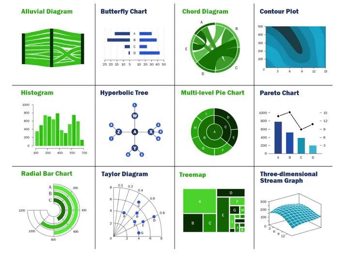 Image credit: Unsplash
Charts
# Run this app with `python app.py` and
# visit http://127.0.0.1:8050/ in your web browser.
from dash import Dash, dcc, html
import plotly.express as px
import pandas as pd
app = Dash()
df = pd.read_csv('https://gist.githubusercontent.com/chriddyp/5d1ea79569ed194d432e56108a04d188/raw/a9f9e8076b837d541398e999dcbac2b2826a81f8/gdp-life-exp-2007.csv')
fig = px.scatter(df, x="gdp per capita", y="life expectancy",
size="population", color="continent", hover_name="country",
log_x=True, size_max=60)
app.layout = html.Div([
dcc.Graph(
id='life-exp-vs-gdp',
figure=fig
)
])
if __name__ == '__main__':
app.run(debug=True)

lang. preferences
Go Syntax highlight
1package main
2
3import "fmt"
4
5func main() {
6 for i := 0; i < 3; i++ {
7 fmt.Println("Value of i:", i)
8 }
9}
| |
Table
| school | sex | age | address | famsize | Pstatus | Medu | Fedu | Mjob | Fjob | reason | guardian | traveltime | studytime | failures | schoolsup | famsup | paid | activities | nursery | higher | internet | romantic | famrel | freetime | goout | Dalc | Walc | health | absences | passed |
|---|---|---|---|---|---|---|---|---|---|---|---|---|---|---|---|---|---|---|---|---|---|---|---|---|---|---|---|---|---|---|
| GP | F | 18 | U | GT3 | A | 4 | 4 | at_home | teacher | course | mother | 2 | 2 | 0 | yes | no | no | no | yes | yes | no | no | 4 | 3 | 4 | 1 | 1 | 3 | 6 | no |
| GP | F | 17 | U | GT3 | T | 1 | 1 | at_home | other | course | father | 1 | 2 | 0 | no | yes | no | no | no | yes | yes | no | 5 | 3 | 3 | 1 | 1 | 3 | 4 | no |
| GP | F | 15 | U | LE3 | T | 1 | 1 | at_home | other | other | mother | 1 | 2 | 3 | yes | no | yes | no | yes | yes | yes | no | 4 | 3 | 2 | 2 | 3 | 3 | 10 | yes |
| GP | F | 15 | U | GT3 | T | 4 | 2 | health | services | home | mother | 1 | 3 | 0 | no | yes | yes | yes | yes | yes | yes | yes | 3 | 2 | 2 | 1 | 1 | 5 | 2 | yes |
Embed Docs
Owl bet you'll lose this staring contest 🦉 pic.twitter.com/eJh4f2zncC
— San Diego Zoo Wildlife Alliance (@sandiegozoo) October 26, 2021
Data Frames
Save your spreadsheet as a CSV file in your page’s folder and then render it by adding the Table shortcode to your page:
{{< table path="results.csv" header="true" caption="Table 1: My results" >}}
renders as
| school | sex | age | address | famsize | Pstatus | Medu | Fedu | Mjob | Fjob | reason | guardian | traveltime | studytime | failures | schoolsup | famsup | paid | activities | nursery | higher | internet | romantic | famrel | freetime | goout | Dalc | Walc | health | absences | passed |
|---|---|---|---|---|---|---|---|---|---|---|---|---|---|---|---|---|---|---|---|---|---|---|---|---|---|---|---|---|---|---|
| GP | F | 18 | U | GT3 | A | 4 | 4 | at_home | teacher | course | mother | 2 | 2 | 0 | yes | no | no | no | yes | yes | no | no | 4 | 3 | 4 | 1 | 1 | 3 | 6 | no |
| GP | F | 17 | U | GT3 | T | 1 | 1 | at_home | other | course | father | 1 | 2 | 0 | no | yes | no | no | no | yes | yes | no | 5 | 3 | 3 | 1 | 1 | 3 | 4 | no |
| GP | F | 15 | U | LE3 | T | 1 | 1 | at_home | other | other | mother | 1 | 2 | 3 | yes | no | yes | no | yes | yes | yes | no | 4 | 3 | 2 | 2 | 3 | 3 | 10 | yes |
| GP | F | 15 | U | GT3 | T | 4 | 2 | health | services | home | mother | 1 | 3 | 0 | no | yes | yes | yes | yes | yes | yes | yes | 3 | 2 | 2 | 1 | 1 | 5 | 2 | yes |
Diagrams
Hugo Blox supports the Mermaid Markdown extension for diagrams.
An example flowchart:
```mermaid
graph TD
A[Hard] -->|Text| B(Round)
B --> C{Decision}
C -->|One| D[Result 1]
C -->|Two| E[Result 2]
```
renders as
An example sequence diagram:
```mermaid
sequenceDiagram
Alice->>John: Hello John, how are you?
loop Healthcheck
John->>John: Fight against hypochondria
end
Note right of John: Rational thoughts!
John-->>Alice: Great!
John->>Bob: How about you?
Bob-->>John: Jolly good!
```
renders as
An example class diagram:
```mermaid
classDiagram
Class01 <|-- AveryLongClass : Cool
Class03 *-- Class04
Class05 o-- Class06
Class07 .. Class08
Class09 --> C2 : Where am i?
Class09 --* C3
Class09 --|> Class07
Class07 : equals()
Class07 : Object[] elementData
Class01 : size()
Class01 : int chimp
Class01 : int gorilla
Class08 <--> C2: Cool label
```
renders as
An example state diagram:
```mermaid
stateDiagram
[*] --> Still
Still --> [*]
Still --> Moving
Moving --> Still
Moving --> Crash
Crash --> [*]
```
renders as
---
title: "Data Science Visualization Techniques"
date: 2025-02-13
author: "Your Name"
categories: ["Data Science", "Visualization"]
tags: ["Data Visualization", "Machine Learning", "Python", "Matplotlib"]
draft: false
summary: "An exploration of data science visualization techniques to help data scientists communicate insights effectively."
math: true
---
# Introduction
In the world of data science, **visualization** plays a crucial role in making sense of large datasets and communicating insights effectively. Whether you're a beginner or an experienced data scientist, understanding how to use various visualization techniques is essential for analyzing and presenting data in a clear and intuitive way.
In this post, we'll explore some of the most common **data visualization techniques** used in data science, with examples using **Python** libraries like **Matplotlib**, **Seaborn**, and **Plotly**.
## 1. **Line Plots for Time Series Data**
Line plots are one of the most widely used visualization techniques for time series data. They help track changes over time and can highlight trends, cycles, and anomalies in your dataset.
Here’s an example of a **line plot** using **Matplotlib**:
```python
import matplotlib.pyplot as plt
import pandas as pd
# Sample time series data
data = pd.Series([1, 2, 4, 8, 16, 32, 64], index=pd.date_range('2025-01-01', periods=7))
# Line plot
plt.figure(figsize=(10, 6))
plt.plot(data, marker='o', linestyle='-', color='b')
plt.title('Exponential Growth Over Time')
plt.xlabel('Date')
plt.ylabel('Value')
plt.grid(True)
plt.show()
Explanation: This plot shows how a dataset grows exponentially over time, which is useful for analyzing trends and predicting future values.
2. Scatter Plots for Relationship Between Variables
Scatter plots are helpful for visualizing the relationship between two continuous variables. They allow you to detect patterns, correlations, and outliers.
Here’s an example of a scatter plot using Seaborn:
import seaborn as sns
# Sample data
tips = sns.load_dataset('tips')
# Scatter plot
plt.figure(figsize=(8, 6))
sns.scatterplot(x='total_bill', y='tip', data=tips, hue='sex', style='time')
plt.title('Relationship Between Total Bill and Tip')
plt.xlabel('Total Bill')
plt.ylabel('Tip')
plt.show()
Explanation: This scatter plot shows the relationship between the total bill and the tip, with points differentiated by gender and time of day. You can easily spot patterns and outliers in the data.
3. Bar Plots for Categorical Data
Bar plots are used to compare quantities across different categories. They can be horizontal or vertical and are perfect for showing the distribution of a categorical variable.
Here’s an example of a bar plot using Seaborn:
# Bar plot
plt.figure(figsize=(10, 6))
sns.barplot(x='day', y='total_bill', data=tips, estimator=sum)
plt.title('Total Bill Sum for Each Day of the Week')
plt.xlabel('Day')
plt.ylabel('Total Bill Sum')
plt.show()
Explanation: This bar plot shows the total bill sum for each day of the week in the dataset. It provides a clear visual comparison across categories.
4. Heatmaps for Correlation Matrices
Heatmaps are perfect for visualizing complex datasets, especially when working with correlation matrices. They help you identify the strength of relationships between multiple variables at a glance.
Here’s an example of a heatmap using Seaborn:
# Correlation heatmap
corr = tips.corr()
plt.figure(figsize=(8, 6))
sns.heatmap(corr, annot=True, cmap='coolwarm', vmin=-1, vmax=1)
plt.title('Correlation Matrix Heatmap')
plt.show()
Explanation: This heatmap visualizes the correlation matrix of numerical features in the tips dataset, helping you identify which variables are strongly correlated.
5. Interactive Plots with Plotly
Sometimes static plots aren’t enough, especially for large datasets or when you want users to explore data interactively. Plotly provides interactive plotting capabilities to zoom, hover, and filter data.
Here’s an example of an interactive scatter plot using Plotly:
import plotly.express as px
# Interactive scatter plot
fig = px.scatter(tips, x='total_bill', y='tip', color='sex', hover_data=['day', 'time'])
fig.update_layout(title='Interactive Scatter Plot')
fig.show()
Explanation: This Plotly scatter plot allows users to interact with the data, hover over points for additional information, and visualize the relationship between total_bill and tip.
Conclusion
Data visualization is an essential skill for any data scientist. By using these visualization techniques, you can not only make your data more understandable but also effectively communicate your findings to stakeholders. Whether you’re using simple line plots, scatter plots, or advanced interactive visualizations, the goal is to make your insights as clear and actionable as possible.
If you’d like to explore more data visualization techniques or need help with specific visualizations, feel free to reach out in the comments below.
Happy visualizing!
Note: To display this post correctly, make sure your Hugo site is properly set up with the Academic theme and necessary libraries (like Matplotlib, Seaborn, and Plotly) installed.
How to Use This Content:
- Save the file: Copy the above content into a Markdown file (
.md), e.g.,data-science-visualization-techniques.md. - Place it in your Hugo site: Add the file in the appropriate folder, such as
/content/post/or/content/blog/, depending on your Hugo structure. - Ensure dependencies: Install any required Python libraries (like Matplotlib, Seaborn, Plotly) on your server if you want the code snippets to run correctly.
This example will allow you to display data science visualizations in an academic, blog-style post using Hugo. Let me know if you’d like further customization!